
Analyze Profit and Loss

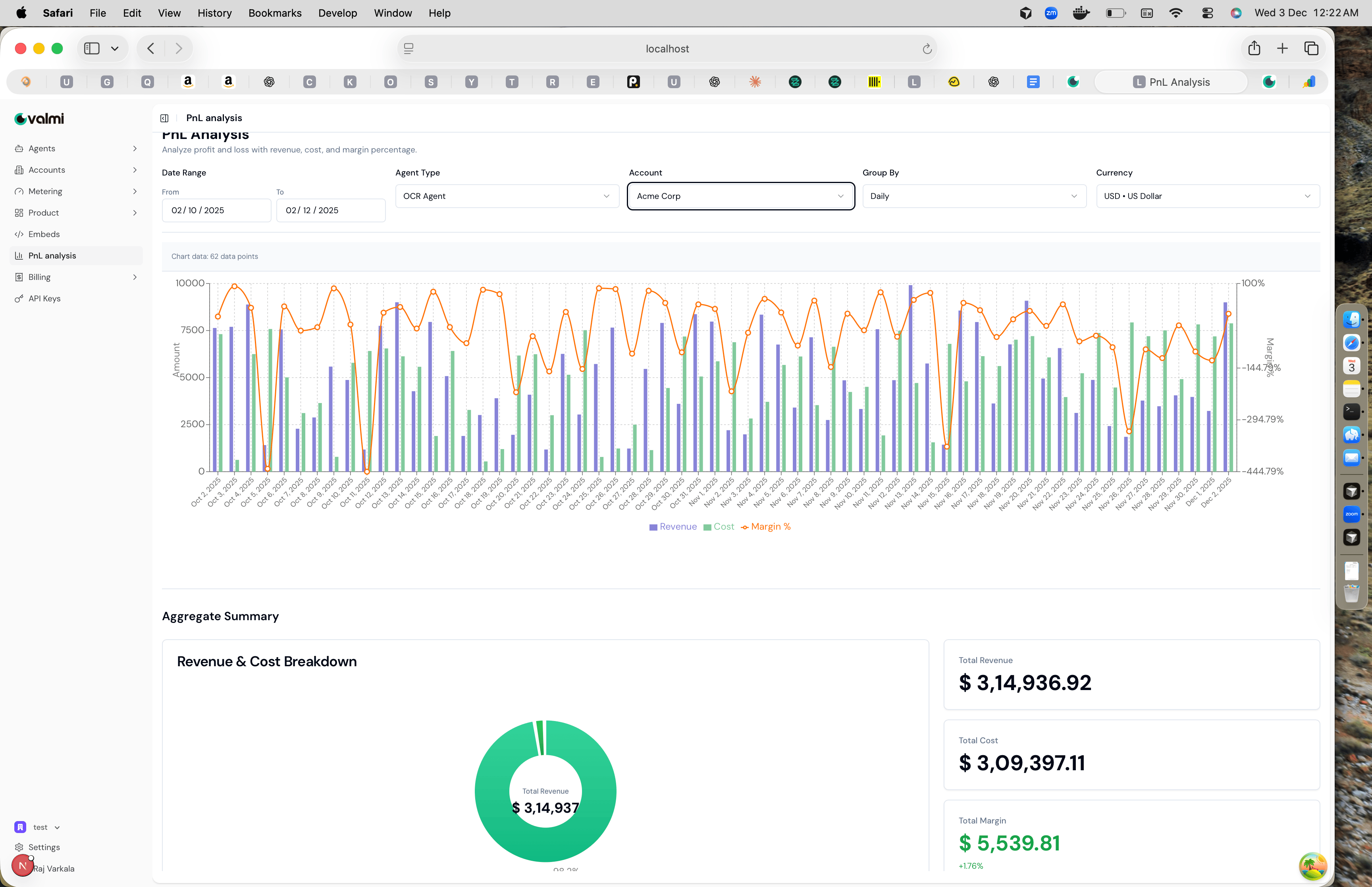
PnL Analysis helps you understand the profitability of your AI services by comparing revenue from customers against the costs of running your agents. This guide shows you how to navigate the PnL dashboard, filter data by agent type and customer, and interpret the charts and metrics.

Step 1: Navigate to PnL Analysis

Go to PnL analysis in the left sidebar. The dashboard opens with a chart showing revenue, costs, and margin percentage over time, along with aggregate summary cards at the bottom. PnL Analysis dashboard showing chart with revenue, cost, and margin percentage, along with filters and aggregate summary The page displays “Analyze profit and loss with revenue, cost, and margin percentage” at the top, followed by filter controls and the main visualization.

Step 2: Filter by Date Range and Grouping

At the top of the page, you’ll find filter controls. Set the date range using the From and To date pickers to analyze a specific time period. The Group By dropdown lets you aggregate data by Daily, Weekly, or Monthly intervals. Daily grouping shows day-by-day trends, while monthly grouping provides a higher-level overview. The Currency dropdown lets you view all amounts in your preferred currency, such as USD or EUR. This is useful when you have customers in different regions.

Step 3: Filter by Agent Type

Use the Agent Type dropdown to focus on a specific agent. Select “OCR Agent” to see profitability for just that agent, or leave it blank to see data across all agents. This helps you identify which agents are most profitable and which might need optimization. When you change the agent type, the chart updates automatically to show revenue, costs, and margin percentage for that specific agent over the selected date range.

Step 4: Filter by Customer Account

The Account dropdown lets you filter by customer. Select “Acme Corp” to see profitability for that specific customer, or leave it blank to see aggregated data across all customers. This is useful for understanding which customers are most valuable and which relationships might need attention. Combining account and agent type filters lets you drill down into specific customer-agent combinations to see exactly how profitable each relationship is.

Step 5: Understanding the Chart

The main chart displays three metrics over time. Purple vertical bars represent Revenue, showing how much you’re billing customers. Green vertical bars represent Costs, showing your expenses for LLMs, APIs, and infrastructure. The orange line with circular markers shows Margin %, which is the profitability percentage calculated as (Revenue - Cost) / Revenue × 100. The chart has two Y-axes: the left axis shows amounts in dollars, and the right axis shows margin percentage. Positive margin percentages indicate profitability, while negative values mean costs exceed revenue for that period. Hover over any data point to see exact values for that date.

Step 6: Aggregate Summary

Below the chart, the Aggregate Summary section provides an overview of the entire filtered period. The donut chart on the left visualizes total revenue. The summary cards on the right show three key metrics: Total Revenue displays the sum of all customer billing, Total Cost shows your total expenses, and Total Margin shows the difference along with the margin percentage. A positive margin percentage in green indicates overall profitability, while a negative percentage in red means costs exceed revenue. Use these numbers to quickly assess whether your current pricing and cost structure are sustainable.